
Differential Gene Expression Analysis in Alzheimer’s Disease
- Client or Institution: Reproducible Research Project
- Project Goal: Identify and visualize differentially expressed genes (DEGs) in Alzheimer’s disease using RNA-Seq data and statistical methods
- Tools Used: R, DESeq2, Ggplot2, ComplexHeatmap, Python (preprocessing)
- Duration: 3 weeks
- Outcome: Discovered top DEGs in Alzheimer’s disease; created a public Shiny app to interactively explore MA plots, dispersion, heatmaps, PCA, and gene counts
- Dataset: GSE53697
- Web App: Explore Webapp
From Preprocessing to Shiny App Exploration Using DESeq2
Abstract
This project presents a full workflow for differential gene expression analysis (DGE) using RNA-Seq data from the GSE53697 dataset. After performing quantile normalization and exploratory analysis using PCA, outliers were detected and excluded. Differential analysis was then carried out using the DESeq2 package in R.
The results were visualized through a variety of plots—MA, dispersion, volcano, PCA, and heatmaps—highlighting key transcriptional changes between Alzheimer’s patients and healthy controls. A Shiny dashboard was also created to allow collaborators and researchers to explore the data interactively.
🧠 Background & Problem Statement
Understanding how gene expression is altered in Alzheimer’s is crucial for identifying potential biomarkers and therapeutic targets. However, such datasets are high-dimensional and noisy, and require careful preprocessing, normalization, and statistical testing.
This project addresses the full spectrum of this challenge:
- Preprocess the GSE53697 RNA-Seq dataset
- Remove noise/outliers
- Perform DGE analysis
- Deliver interactive plots for better interpretation
🗂 Dataset
GSE53697 is a public gene expression dataset from the GEO repository. It contains RNA-Seq data from both Alzheimer’s and Control human samples.
📌 Preprocessing
- Quantile normalization (via
preprocessCorein R) - PCA used to identify and exclude strong outliers
- Raw counts retained for DESeq2 analysis
⚙️ Workflow Overview
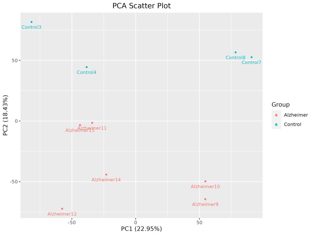
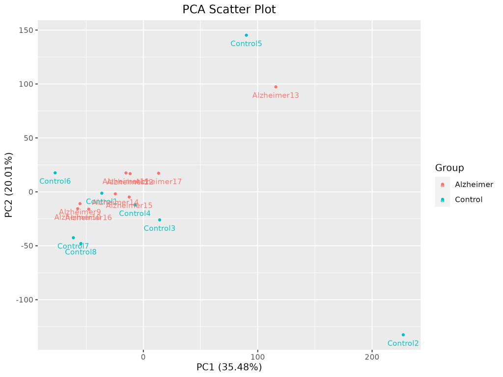
1. Exploratory Data Analysis (EDA)
PCA Scatter Plot
PCA was used to detect outlier samples and observe clustering by disease state.
2. Differential Expression Analysis with DESeq2
- DESeq2 was used to fit models to count data
- Statistical tests computed
log2FoldChange,p-value, andadjusted p-value (padj) - Significant DEGs were defined by
|log2FC| > 1andpadj < 0.05
📊 Visualizations
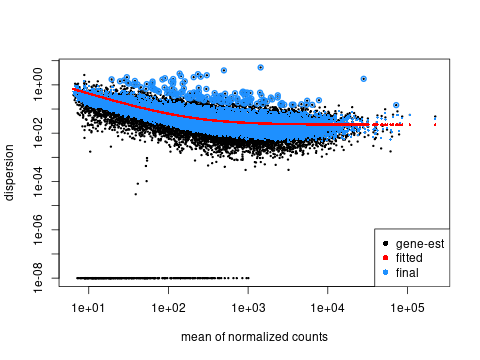
📈 Dispersion Plot
Assesses model fit and biological variability.
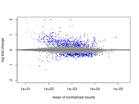
🧪 MA Plot
Mean of normalized counts vs log2 fold change.
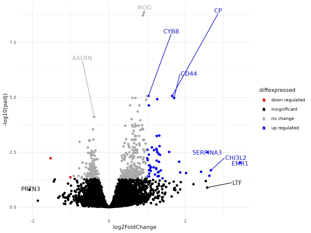
🌋 Volcano Plot
Combines significance and magnitude for gene prioritization.
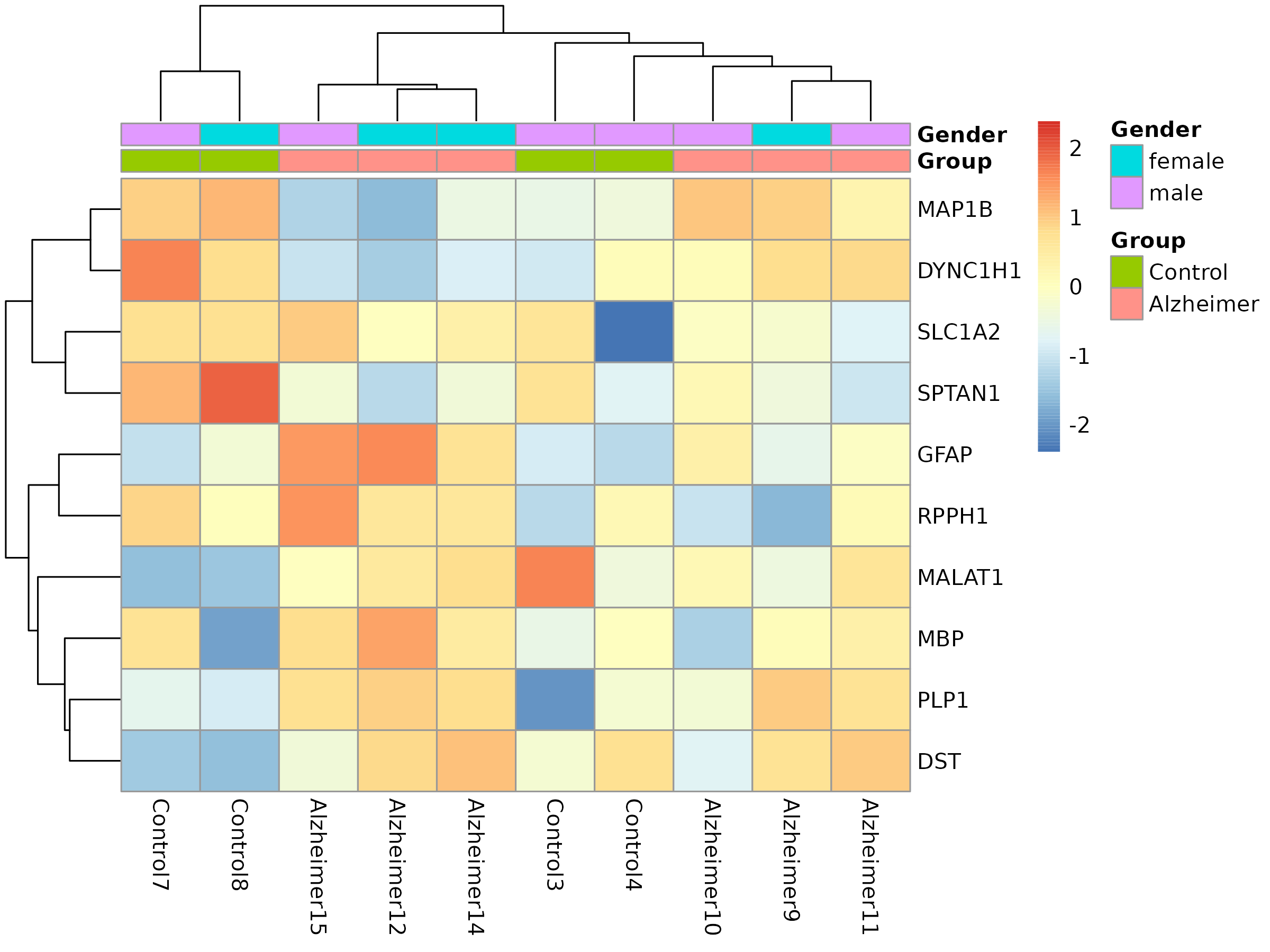
🧬 Heatmap of Top DEGs
Shows clustered gene expression patterns across conditions and genders.

🧰 Outcome
- Identified multiple upregulated genes (e.g., CP, CD44, SERPINA3)
- Built interactive Shiny app to explore:
- PCA
- Volcano plots
- MA & dispersion plots
- Count plots for any gene
- Heatmaps with annotation tracks
- Shiny dashboard uses
.rdsobject and renders plots withggplot2,plotly,ComplexHeatmap, andshinydashboard
💡 Lessons Learned
- PCA was essential for quality control and sample exclusion
- Outlier removal substantially improved the clarity of DE patterns
- Automating Shiny dashboard deployment provides an efficient way to share complex analyses
💬 Discussion
This project offers a reproducible, interpretable, and shareable pipeline for DGE analysis. It highlights best practices in both statistical rigor (DESeq2, multiple testing correction) and communication (interactive visualization). The analysis aligns well with reproducibility standards and can serve as a blueprint for similar transcriptomics projects.
📣 Call to Action
Got a GEO dataset you’d like to explore?
🔬 I can help you turn raw expression data into clear, interactive insights.
💬 Start a conversation to build your own DESeq2 pipeline or Shiny dashboard.

Leave a comment