Tag: Data Visualization
-
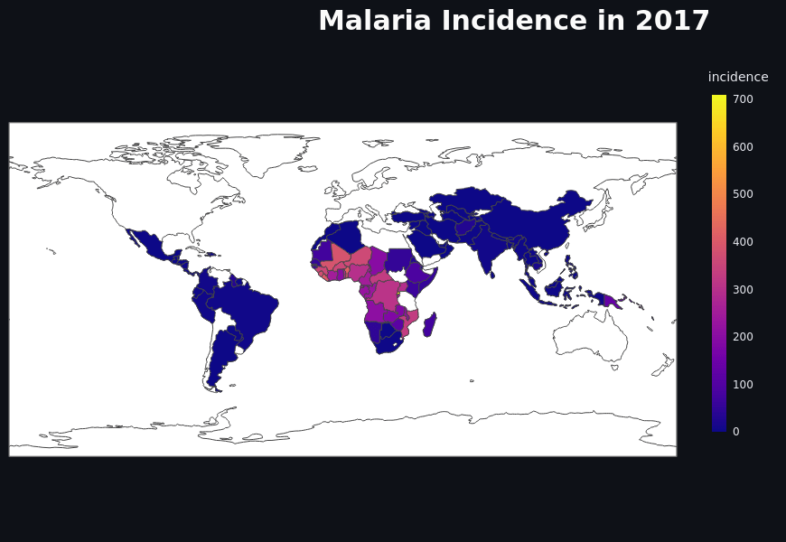
Predicting Malaria Incidence from Climate Data Using Machine Learning
The project aimed to predict malaria incidence using climate and geographical data through machine learning, deploying a Streamlit web app for visualization across 98+ countries. With data from WHO and others, the CatBoost model achieved a 96.7% correlation. It provides easily accessible insights for researchers and policymakers, addressing malaria’s global health challenge.
-
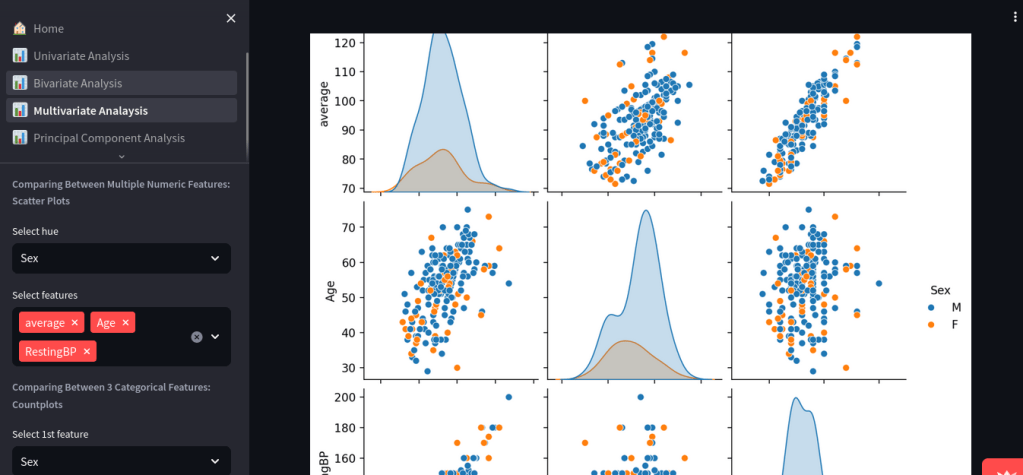
Dynamic Exploratory Data Analysis with Streamlit
The Dynamic Exploratory Data Analysis app simplifies EDA for users of all skill levels by allowing CSV uploads and generating insightful visualizations. Developed with Streamlit, it automates data type detection and offers various analysis modules. Key features include univariate, bivariate, and multivariate visualizations, making data exploration accessible and effective.
-
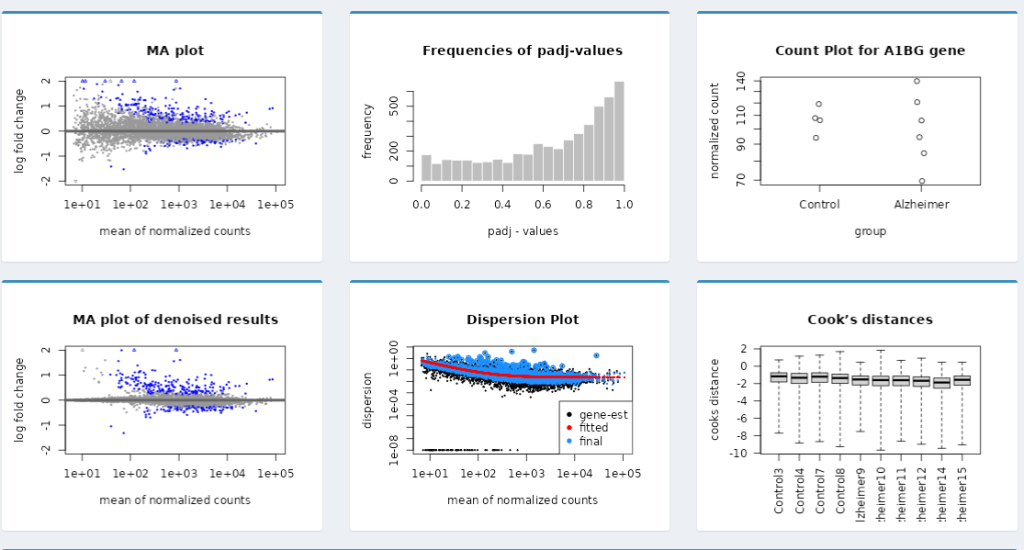
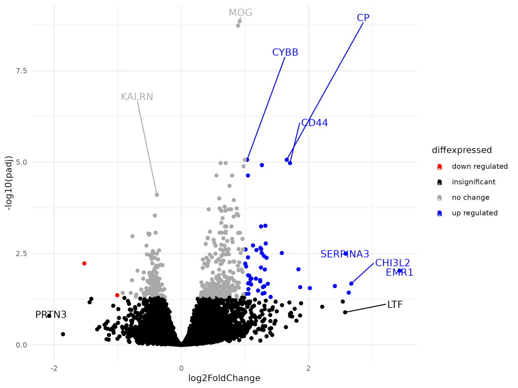
Dynamic Shiny Dashboard for the Visualization of DESeq2 Results
The project developed an interactive Dynamic Shiny Dashboard to visualize DESeq2 differential expression results, allowing users to explore data without R programming skills. It features various visualizations such as volcano plots and heatmaps, facilitating effective communication of results while supporting collaborative efforts in bioinformatics. The project lasted two weeks.
-
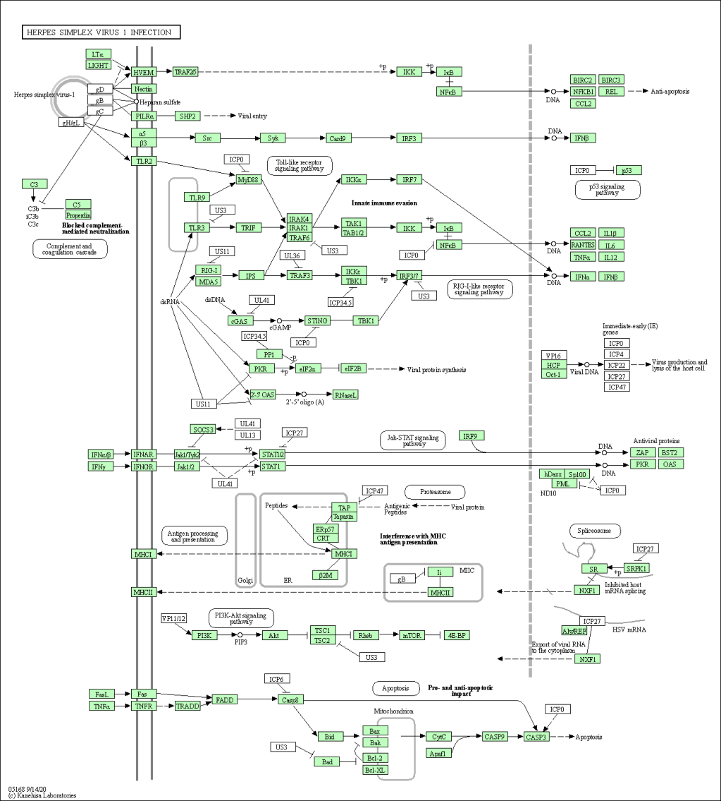
Gene Set Enrichment and KEGG Pathway Analysis Using ClusterProfiler
The project utilized KEGG-based gene set enrichment analysis from DESeq2 results to visualize biological pathway alterations in Alzheimer’s disease. Using R and ClusterProfiler, enriched pathways were identified and visualized, revealing significant immune and neurodegenerative responses. The findings could inform future research and biomarker discovery in Alzheimer’s.
-
Differential Gene Expression Analysis in Alzheimer’s Disease
This project conducts differential gene expression analysis on Alzheimer’s disease using RNA-Seq data from the GSE53697 dataset, identifying differentially expressed genes (DEGs) via DESeq2 in R. It emphasizes preprocessing, outlier removal, and visualization through a Shiny app, facilitating interactive exploration of results, enhancing understanding of gene expression changes.
